TL;DR
Zzeeh Productions, a wedding & events company, was struggling with an outdated website that confused users and hurt lead conversions. I redesigned their website to clearly communicate their value proposition, streamline their enquiry process and position them as a "Premium-yet-affordable" brand.
While the full website design is under NDA, this case study walks through the redesign of the Global Landing Page withmy approach, learnings, and the final outcome.
[Final output]
Here's how the final output looked like (Expand for the best view):
There are many animations and interactions throughout the page. Hit 'R' to restart the prototype if they don't load on the first instance.
And if you're here for the details, let me take you on a ride:
[How it started]
A school friend reached out because he needed help revamping the website of his brother’s company, Zzeeh Productions, which specializes in wedding and event planning. The company positions itself as "Premium-yet-affordable", a balance they achieve by producing decor and event essentials in-house, and even renting them out to others.
But their website didn’t reflect this well. It harmed them more than it did good.
[What wasn’t working]
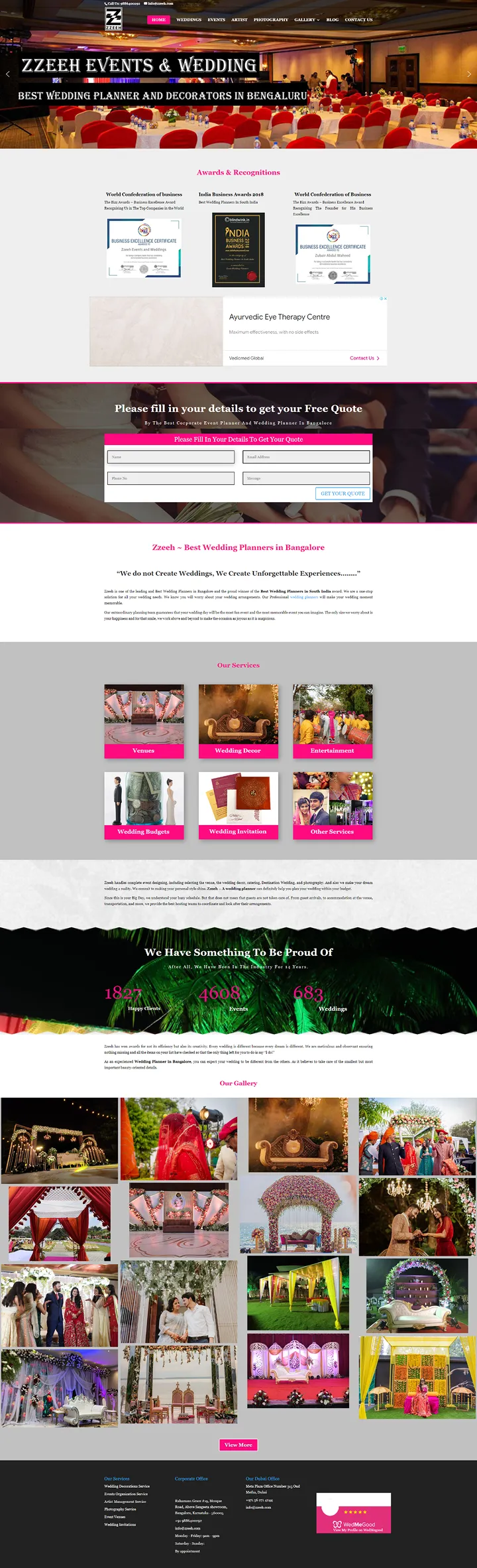
Their existing website suffered from multiple issues:
- Outdated visual design: This made the website look less premium than they actually were.
- Poor information structure: Weddings, Corporate Events, and Rentals were all jumbled together.
- Disconnected enquiry form: One generic form for all services created confusion.
This led to confused visitors and poor lead conversions. For a business that relies heavily on trust and inquiries, this was a major gap.
[Goals]
To fix this, I focused on two core outcomes:
- Clarity in communication: Reinforce Zzeeh’s "premium-yet-affordable" identity and explain how they achieve this.
- Seamless lead generation: Create clear pathways for their three business verticals - Weddings, Events and Equipment Rentals, with their own sub-landing pages and enquiry flows.
[Design process]
Since only the landing page could be showcased (the rest is under NDA), I made sure it:
- Gave an immediate sense of quality and trust through visuals and copy. I also designed both Light and Dark themes for more accessibility.
- Highlighted what makes Zzeeh different, the fact that they make everything in-house, which is rare in this space.
- Had a clearly labeled navigation system that made it easy for users to find their intent.
[Personal learnings]
This project taught me how to:
- Turn vague feedback into design decisions. The client often said things like “make it more premium” or “something is off” and I had to translate that into tangible UI changes.
- Extend my UI craftsmanship. I pushed myself to raise my own bar for design quality.
Thanks for reading till the end!
Interested in seeing the full end-to-end design flow? Let’s connect over a short call!